TransComfort
A rebuilt website for a company that drives wheelchair and ambulatory passengers to appointments, dialysis and hospital discharges across Colorado. It is designed for older and low-vision riders and for the care facilities that schedule their trips.
Offline. Shown from saved captures.
- Type
- Website
- Client
- TransComfort
- Location
- Front Range, Colorado
- Year
- 2026
- My role
- Design, development, accessibility audits
- Status
- Offline


The brief
TransComfort’s riders are largely older and many have low vision, so the rebuild had to be easy to read and easy to tap before it was anything else. I made accessibility the design constraint: WCAG 2.2 AA plus selected AAA criteria, with 20px body text at 7:1 contrast and 48px touch targets, all checked by scripts against the rendered page.
What I built
- 22 pages, including eight county service-area pages, a pricing explainer, a facilities page and an accessibility statement, with redirects from the old site’s URLs
- Type system for low-vision readers: Atkinson Hyperlegible Next body copy, Source Serif 4 headings, 20px base text with nothing under 18px, and no motion
- County pages naming 185 hospitals, dialysis centers and care facilities, each checked against federal CMS provider data and the US Census geocoder
- Colorado locator map drawn from real coordinates in about 2 KB, with no map library, tiles or outside requests
- Pricing page that explains how a fare is built from base fare, loaded miles and waiting time, and lists every factor that can change it
- Facilities page for nursing, rehab, assisted living and dialysis schedulers, covering standing orders and monthly invoices itemized by resident and trip
- Audit scripts that check touch-target size and spacing, rendered contrast, layout and speed, plus tuned font fallbacks that keep layout shift near 0.001
- Phone-first booking with no forms and no outside scripts, so nothing sensitive passes through a third-party form service
Details worth a look
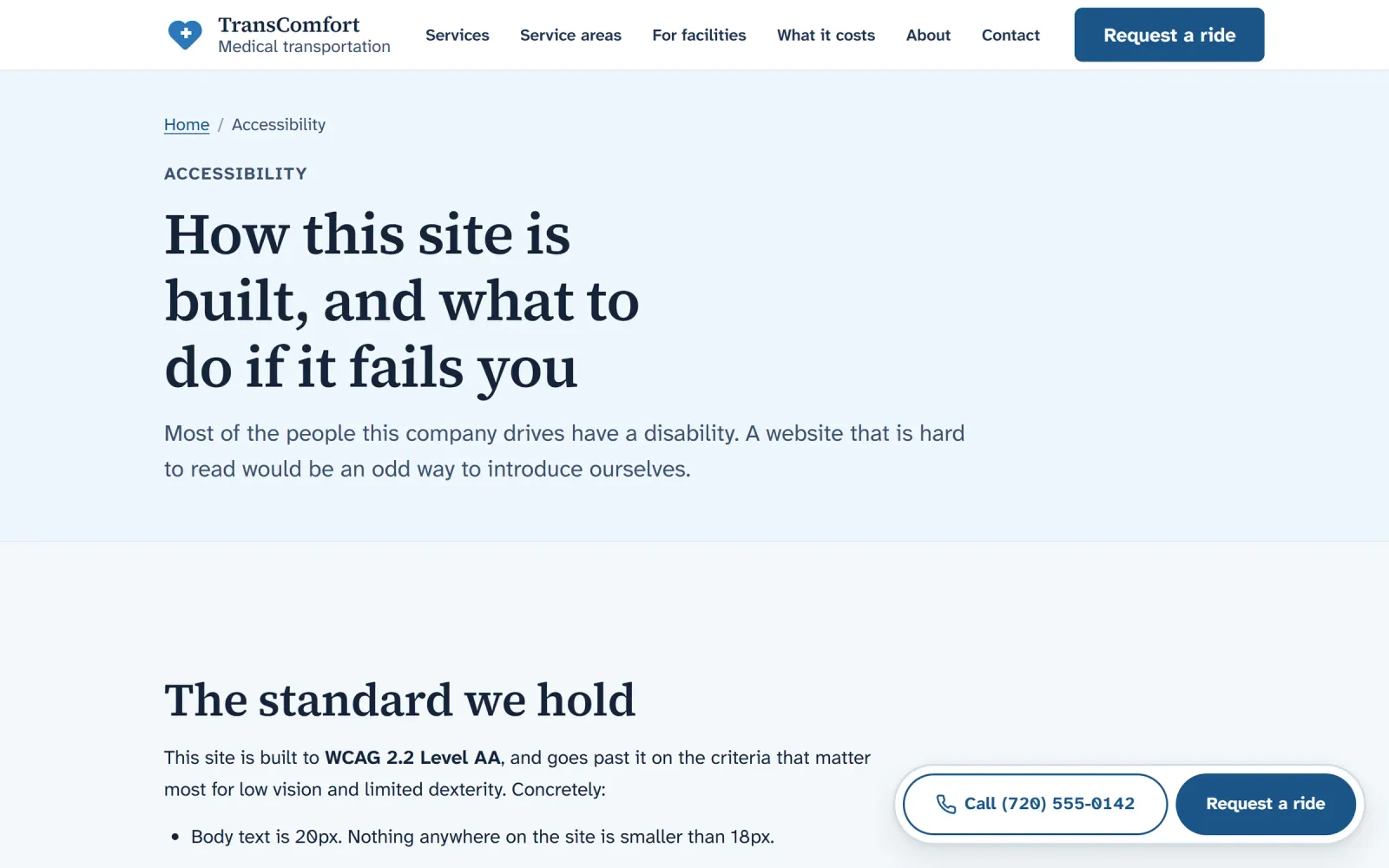
Detail 01
The site publishes its accessibility standard in plain language, along with what a rider can do if any page fails them.
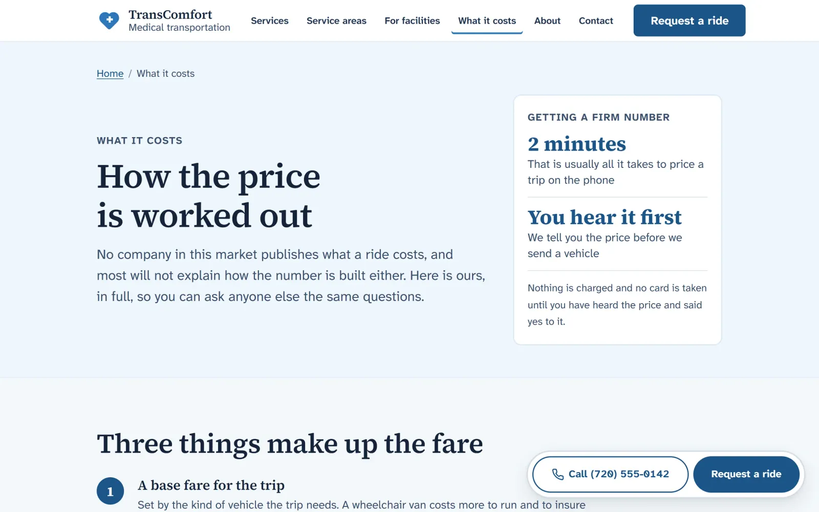
Detail 02
The pricing page explains how every fare is built, so a caller knows the right questions to ask before booking.
The whole page
Homepage, 1440px wide


Showing the top of the page.
Want something like this for your business?
Tell me what you’re working on. A few sentences is plenty to start.